In the UK, vaccinated persons over the past four weeks now account for:
90% of COVID Deaths; 87% are Fully Vaccinated (16%) or Boosted (71%)
79% of COVID Hospitalizations: 75% Fully Vaccinated (14%) or Boosted (61%)
77% of all COVID Cases: 72% Fully Vaccinated (13%) or Boosted (59%)
This week’s UKHSA COVID data update continues the trend we’ve been pointing out. We’ll show the new metrics from multiple angles, and we’ll compare these to US data, which is dramatically different than UK. We’ll show why this indicates US data are skewed and incorrect.
***Edit: Source links inserted here for all data utilized:
UKHSA Week 3 Report: https://t.co/kpDll77yYc
UKHSA Week 10 Report: https://t.co/UhQSxNvSwm
UKHSA Raw Data File (Vaccination Numbers - Tab 62): https://t.co/aNvvz9kEy8
CDC CoV2 Data: https://t.co/2Etx0i2N4P
Bear in mind the UK has high vaccination rates, so the population sizes for 2+ doses much higher than Unvaccinated in all adult categories, including the 18-29 with ~63% Fully Vaccinated (~36% 3-Dose). All age groups 40 and above are above 50% Boosted with 70+ ~94% Boosted, so it is expected to have most COVID outcomes in these ranges. However, we will show RATES per cohort size, too, so you can directly compare against the base rates.
First, here are basic pie charts showing the 7-week change in share of COVID outcomes by vaccination status (# of doses). These are not adjusted for age nor population size. They are simply showing the breakdown by # of doses.
Left Pie = Week 3 Report covering Weeks 51 (2021) through 2 (2022)
Right Pie = Week 10 Report covering Weeks 6 through 9 (2022)
Cases (All Ages)
Notable shifts:
3-Dose: 29.40% → 58.71% (doubled)
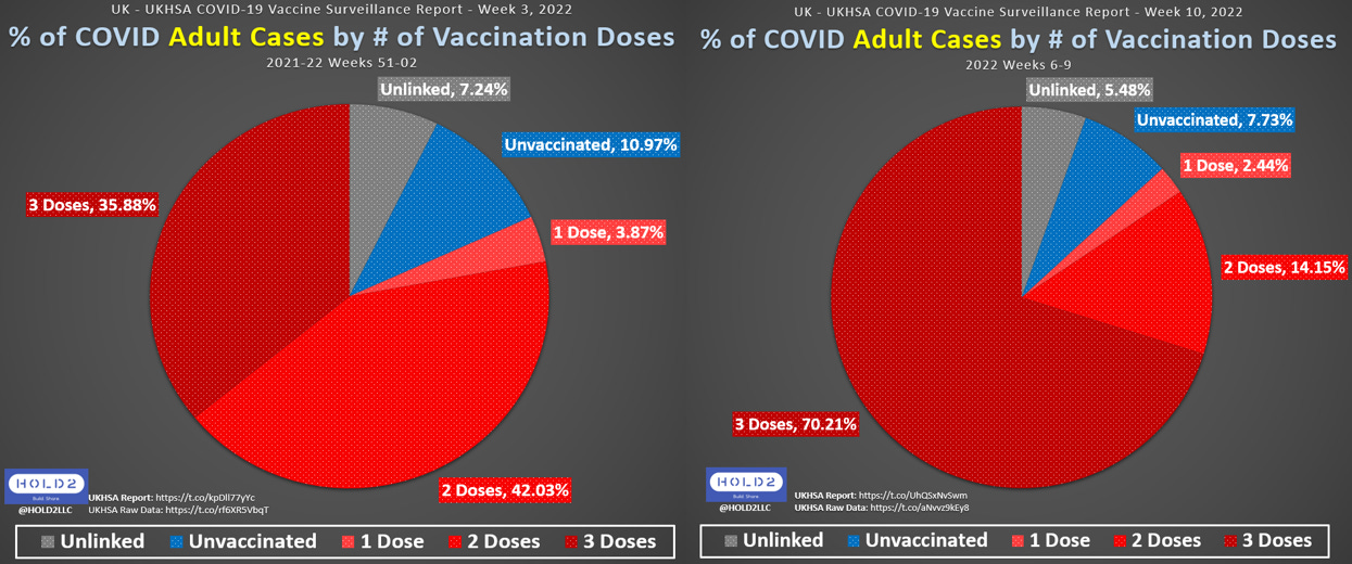
Cases (Adults Only)
This Adults-Only view is important to show, because children have very low vaccination rates, so almost 2/3 of all Unvaccinated Cases occur in children.
Notable shift:
3-Dose: 35.88% → 70.21% (almost doubled)
Hospitalizations (All Ages)
Notable shifts:
Unvaccinated: 31.65% → 20.38% (this is much larger than the reduction in Unvax pop size)
3-Dose: 34.26% → 61.06% (~27-point increase)
Hospitalizations (Adults Only)
Notable shifts:
Unvaccinated: 25.51% → 13.28% (this is much larger than the reduction in Unvax pop size)
3-Dose: 38.06% → 67.76% (~30-point increase)
Deaths (All Ages)
Notable shifts:
Unvaccinated: 26.07% → 9.72% (this is much larger than the reduction in Unvax pop size)
3-Dose: 32.26% → 70.74% (~38.5-point increase - more than doubled)
% Change in Share of Deaths and Population Sizes
This chart shows the % change in share of deaths compared to the % change in population size over the 7-week span. This is how we see if the change in share of deaths was proportional to the # of people moving up in the vaccination process.
Notable shifts:
Unvaccinated: Share of Deaths dropped 5X more than the reduction in population
2 Doses: Equal changes for both
3 Doses: Share of Deaths INCREASED 4.5X more than the increase in population
This is a rapid shift of COVID outcomes from Unvax to 3-Dose. Why is that happening?
Now, let’s look at COVID outcomes by Age by Vaccination Status, both Raw Counts and Rates Per 100,000. These combo charts also show the 7-week progression from Week 3 (top) to Week 10 (bottom).
Rates per 100k
Cases
Did you realize the 2-Dose rates were highest by far when UKHSA first switched to only showing 3-dose rates in the weekly reports? I did not know until I found the raw data and calculated the rates.
You can also see the 1-Dose rates being quite high in Week 3.
By Week 10, 3-Dose has taken over while Unvaccinated is the lowest in every age group. This is where the NIMS vs ONS denominator argument really shows up, because it may be reasonable for Unvaccinated rates to be close to 1:1 with 3-Dose, but it seems unlikely for 3-Dose persons to get infected at 3X the rate of Unvaccinated as you see in all except the 80+ group (2X).
Even if the Unvax denominator is lower than reality, the trend has continued moving more and more in this direction. 3-Dose is even higher than 1-Dose and 2-Dose in all except the 80+ category.
On the other hand, if the NIMS denominator is accurate or close to accurate, then these data indicate a huge problem. I wish we knew and had better data + methodologies + definitions in the US.
Hospitalizations
Notables:
18-29: Unvax is the lowest of all
Unvax is lower than 1- and 2-Dose in every age group
Unvax-to-Boosted multiples range from 0.93X (negative) to 2.23X (60-69). Only 2 age groups are 2X
Any denominator deficiency that may exist would affect all Unvax outcomes, including Hospitalizations, so keep this in mind
Deaths
Deaths are where we see the greatest vaccination benefit for 3 doses.
Notables:
Unvax-to-Boosted multiples range from 1.17X (18-29) to 4.62X (40-49)
Unvax is lower than 1- and 2-Dose in all ages except 30-39
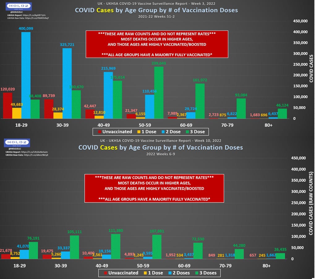
Raw Counts
Each set of charts is kept on the same scale (y-axis) so we can better visualize the change in magnitude across the seven weeks.
Cases
Notables:
2-Dose dominated in younger cohorts initially, but 3-Dose dominates all ages in Week 10
Hospitalizations
Notables:
There is a clear shift from Unvax and 2-Dose to 3-Dose
70+ 3-dose dominate the Hospitalizations but also are ~93-94% Boosted in that population
Deaths
Notables:
Clear shift towards 3-Dose just like Hospitalizations
Older ages dominate again just like Hospitalizations, both because 70+ are 93-94% Boosted and because COVID severe outcomes are disproportionately age-stratified
80+ Boosted account for just under 50% of all COVID deaths for all ages across all dose levels (1,456 vs. 1,487)
70+ Boosted account for 64% of all COVID deaths
70+ Fully Vaccinated (2+ doses) account for 76% of all COVID deaths
Now let’s compare UKHSA vs. US-CDC data to see how far off the US-CDC data are.
This side-by-side view shows US vs. UK for similar ages and similar dates. We can’t compare exact like-for-like due to the CDC only giving us data through Week 52 of 2021 and only having 3 large age ranges.
To compensate, we went with these close comparisons:
US: 65+, Weeks 51-52, 2021 (2 weeks)
UK: 70+, Weeks 51-02, 2021-22 (4 weeks)
Notables:
UK Unvax account for only 21.43% of total COVID deaths, but US Unvax account for 62.76% of total deaths during the same timeframe? As of those dates, the difference in vaccination rates was only 4-5 points (88% vs. 93%)
UK Boosted account for 40.77% of deaths, but US Boosted are only 8.41%. This does not seem plausible
This chart gives the same data but in the form of Rates per 100k so we can directly compare against vaccination levels.
Notables:
Unvax rates between US and UK are only off by 10 points, but…
Look at the 2-Dose differences: 79.22 vs. 6.63?? This looks like the source of the disconnect, but why is the US so different?
3-Dose rates are close from an absolute perspective, but UK is 2.5X the US rate. This does cause the US Unvax multiple to be 2.5X higher than otherwise (31.4 vs. 12.6), so that little absolute difference in denominator makes a huge difference in the multiple
Right side of chart can only show UK, because the CDC lags far behind by only updating data once per month and holding back death reporting several weeks on the calendar
Should we expect US rates to dramatically shift like the UK rates? I expect that, but it may be muted due to how we are collecting, defining, and reporting those data.
More to come, but a little bonus after the break.


