Why do US-CDC and UKHSA COVID data differ so greatly between Vaccinated and Unvaccinated? Let’s take a look.
UKHSA reports weekly, but the CDC only reports monthly. This is likely due to the CDC waiting for individual reports from 24-26 jurisdictions before aggregating and updating its charts. There is also a significant reporting delay for deaths in the US. Even after those data are reported, more come in later during subsequent reports (for prior dates).
Due to this, we only have US COVID Deaths by Vaccination Status through Week 52 of 2021. UK has that data all the way through Week 6 of 2022.
For today, we’ll compare the Week 1 UKHSA Report with Weeks 49-52 of the CDC data.
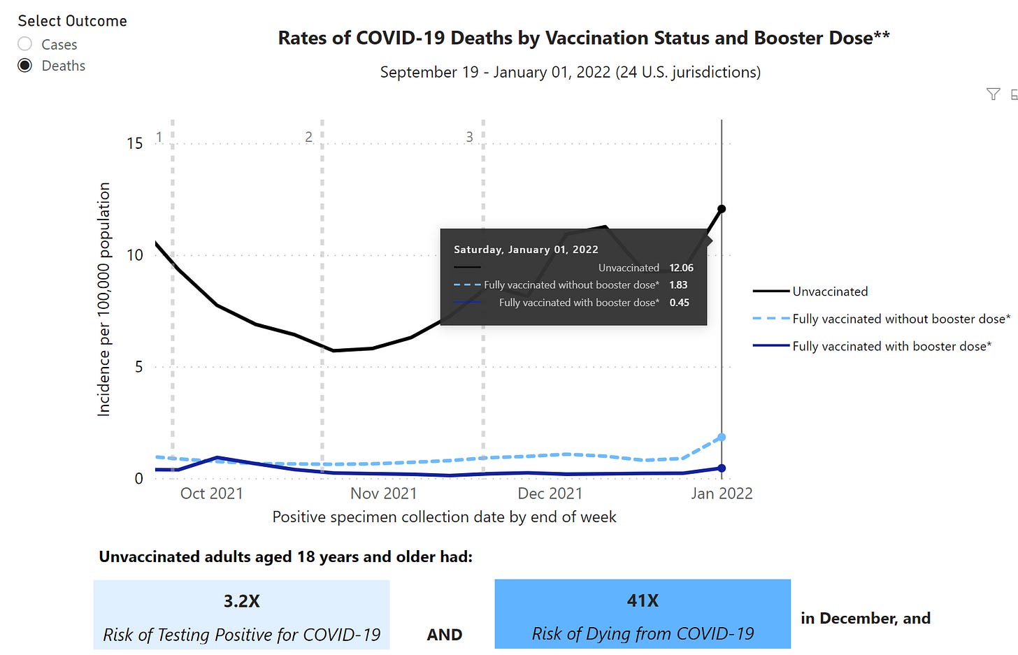
US data is displayed as a time-series by the CDC on at the following link, which was updated most recently on 2/18/22:
This is the source of all the media and gov’t claims that the Unvaccinated are 97X, 68X, and 41X more likely to die than those who are Boosted.
I’ve been trying to figure out how the differentials can be so high in the US but not in the UK or Denmark. Population denominators are a big deal since those directly affect Unvaccinated rates by affecting the denominator.
The CDC also only shows age-adjusted rates, which are abstract and difficult to understand practically. The UK shows crude rates but breaks them down by age group, which avoids the age-adjustment necessity. Thankfully, though, the CDC provides downloadable data so we can see the raw deaths, subcohort sizes, and crude rates before they age-adjust.
***Note: I have COVID Death Rates by Age Group by # of Vax Doses, and those are dramatically different for the UK compared to the CDC, but both sets of rates depend on questionable population estimates. CDC is likely too low, and UK is too high according to some, though UKHSA argues against that. I will show those charts in a separate post.
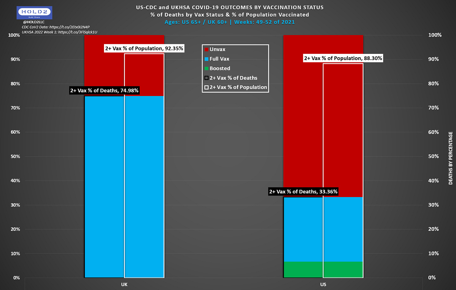
In this next version of the first chart, we add Population Vaccination % (white) and we switch from Raw Death Count to % of Deaths by Vaccination Status. Now, the black line corresponds with the top of the 2-dose section, and you can see the difference between that line and the Vax % of Population (white).
Here are some explanatory details before analyzing:
These are RAW DEATHS and should not be construed as incidence rates (NO BASE RATE FALLACY). They are not population-adjusted nor age-adjusted other than being limited to 60+ and 65+, respectively.
UK data are a combination of 60-69, 70-79, and 80+ for a combined 60+ dataset from the Week 1 2022 UKHSA Report (Pg. 40, Table 12a, Deaths within 28 days)
US data are the 65+ data for weeks 49-52 in the CDC file
UKHSA did not yet report 3-dose outcomes during the Week 1 2022 report, so all 3-dose outcomes are included in the “Full Vax” sub-cohort (light blue)
Vax % of Deaths includes:
Numerator = Vaccinated Deaths with 2 or more doses
Denominator = Vaccinated Deaths with 2 or more doses + Unvaccinated Deaths
Vax % of Deaths DOES NOT include:
UK:
1-dose deaths
Unlinked deaths
US:
Partially vaccinated deaths
Definition: "Excluded were partially vaccinated people who received at least one FDA-authorized vaccine dose but did not complete a primary series >= 14 days before collection of a specimen where SARS-CoV-2 RNA or antigen was detected."
I calculated Population Vaccination % per the following:
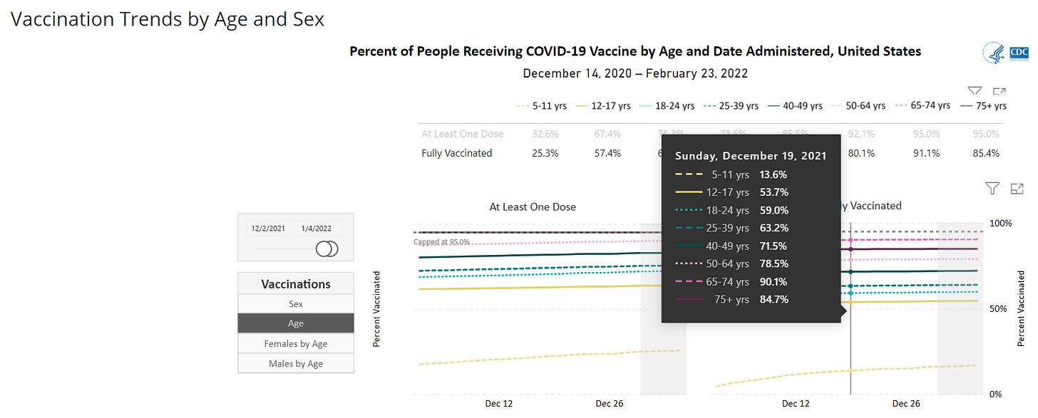
CDC Demographic Trends: 65+ Combined Result = 88.30%
UKHSA Tab 61: 60+ Combined Result = 92.35%
I actually could use some help on sourcing Vax% by Age by Date if anyone has a good source for that for the US and UK beyond what I’ve shown.
Let’s analyze the chart now. What is it telling us?
UK Vaccinated Deaths constitute a much higher percentage of deaths than in the US
74.98 - 33.36 = 41.62 points (125% higher)
The gap between Vax % of Pop and Vax % of Deaths is much higher in the UK than in the US
UK: 74.98 - 92.35 = -17.37 points (18.8% lower than baseline)
US: 33.36 - 88.30 = -54.94 points (62.2% lower than baseline)
What could cause such a large discrepancy?
I contend it’s the combination of issues already pointed out in previous posts
The Vaccine Record Matching problem where we do not count COVID Outcomes as vaccinated until a vax record is matched, which both causes initial skewing when data is first published but continues to skew to an unknown degree since not all records get matched
Counting the Vax status of deaths based on the positive test date as opposed to the date of death
Unknown # of “Partially Vaccinated” deaths in the US data. We DO know the 1-dose and Unlinked death numbers in the UK, but we have no visibility into this with the CDC data
Other potential effects:
Natural Immunity - how many prior infected does each country have, and how many are in the Unvax and Vax cohorts?
Over time, more infections in the Unvax causes Unvax outcomes to improve, thus making Unvax “appear” to look better relative to Vaxxed.
Time from last dose - are UK elderly further from their most recent dose on average? How much would this matter?
In the UK data, we can go one step further and show the breakdown more granularly for 60+. Here we show 60-69, 70-79, and 80+. These data are from the current UKHSA Week 7 Report covering Weeks 3-6 of 2022.
You can see the dramatic difference in raw Deaths for 80+, and it has the highest Vax% of Deaths. We only get 65+ for the US, so we can only assume the same is happening.
The black lines represent % of deaths in each age group vaccinated with 2 or more doses. When comparing to each group’s vaccination %, we see:
80+ 2+-Dose: 90.88 % of Deaths - 94.73% Vaccinated (3.85pt gap)
70-79 2+-Dose: 85.09 % of Deaths - 94.23% Vaccinated (9.14pt gap)
60-69 2+-Dose: 78.85 % of Deaths - 89.87% Vaccinated (11.02pt gap)
The gap shrinks as age increases, and this may be what we should expect. With less granularity in the US data, we can’t see this effect, so we can’t come to conclusions nor make decisions based on this missing knowledge.
This is why we need the following from the CDC:
COVID Outcomes by Vaccination Status by 10yr Age Groups, including:
Partially Vaccinated
Breakdown of how many occurred within 14 days of a dose but were counted in a lower category
Breakdown of how many Boosted or Fully Vaccinated were counted in a lower category based on time of test instead of time of Outcome
Transparency and honesty regarding the Vaccine Record Matching
How frequently does an error occur?
What are the different permutations that lead to a Vax Record Matching failing?
Vaxxed Out-of-state
Vaxxed in a different hospital system
Clerical errors
Failure to submit by vaccinating entity
Inability to identify during hospitalized incapacitation
How many others?
Transparency and explanation of the age-adjustment process and what it really means
They do provide the documentation, but which weighting do they apply, and how do they decide how much to weight?
What is the real-life, practical difference between the age-adjusted and crude rates for a given person? This is important to know
Usage of a proper population denominator for Unvax:
2019 Intercensal is too low
Any Census does not include all residents/migration, so they need to formulate a reasonable estimate of true population, because all COVID outcomes on US soil count towards these numbers
Ok, that’s enough for now. We have a LOT more to show and explain, but I’ll do that in separate posts.
Below the paywall break are some bonus charts. For those of you with access, please leave comments on charts you’d like to see, and I’ll add some or create a special post.


