This week’s NYC CoV2 weekly update shows the continued convergence of Vaccinated and Unvaccinated outcomes.
This first chart shows the % of each outcome belonging to Fully Vaccinated individuals.
What we see:
Cases: 71.3%
Hospitalizations: 64.97%
Deaths: 55.56%
Take note these data are only comparing Fully Vaccinated vs. Unvaccinated while leaving out all Partially Vaccinated, which include:
Those who have not completed a primary vaccination series
Those who are Fully Vaccinated but tested positive within 14 days of the 2nd dose
Those who are Fully Vaccinated but only found 1 mRNA dose during Vaccine Record Matching
If NYC would publish Partial Vax outcomes (like UKHSA), the Vaccinated percentages would be higher for all 3 outcomes.
Let’s look at each outcome individually:
Cases
Yes, that blue line represents Fully Vaccinated cases (raw numbers), and the difference between Vax % of Pop and Vax % of Cases is down to 0.63% as of the Week of 2/26/22. We could already have crossed over as of this writing and probably did cross over the week of 3/5, but we won’t know until next week’s update or later.
Fully Vaccinated became the majority of cases the week of 11/27 (50.63%) but were still well below the % of population Fully Vaccinated at the time (65.04%).
This gap lessened dramatically as of the week of 12/18 when Fully Vaccinated % of Cases jumped to 63.18% while the Full Vax Pop only went up to 66.72%.
The big problem, though, was we could not see this fact at the time those data were released, because the initial release for Week of 12/18 data showed this:
Look at that anomalous dip for 12/18. The data showed:
Cases: 15.66%
Hospitalizations: 13.66%
Deaths: 9.3%
Such extreme (but artificial) outcomes led to @nycHealthy charts that looked like this:
…which were shared widely and used to fearmonger, to oversell vaccination, and to support extreme policies like vaccine mandates for colleges, children, and employers.
But then when the data updated many weeks after Vaccine Record Matching, the numbers looked much different:
Hospitalizations
You’ll notice the Full Vax % of Hospitalizations did not cross over 50% until the week of 1/1 after making a sharp turn upwards the week of 12/18.
Since 1/1, the Full Vax share has increased more rapidly than the Full Vax Pop % and is now at 64.97% for the Week of 3/5. These data typically revise up after future updates, too, so the real gap is likely smaller. Of course, adding Partial Vax to the Vax category would also lessen the gap and possibly flip completely.
As it stands today, though, with the data we CAN see, there is apparent Vaccine Effectiveness (VE) for severe outcomes.
Deaths
For Deaths, we see the Full Vax % is up to 57.50% as of the week of 2/19/22.
The big jump occurred the week of 1/1/22 when the Full Vax % of Deaths crossed over 50% for the first time. There is a 6-week lull directly after that, which I have marked, but I believe those weeks are likely to revise upward when the next 4-week re-matching exercise occurs. It does not seem likely that Vax Deaths would cross over but then cross back and then jump 10 points again in mid-Feb.
Even the last 2 weeks (2/26 & 3/5) were above 50% on their initial release, so the trends point to all dates in 2022 having more Vax than Unvax raw deaths.
Compare to the Base Rate, Full Vax Deaths (57.50%) are still well below the corresponding Full Vax Pop rate (71.54%). This indicates even more VE than with Hospitalizations and of course far more than Cases where there may be none.
Now let’s show rates. A major issue with NYC data is they only publish Age-Adjusted Rates per 100k for Hospitalizations and Deaths. Doing this causes 2 problems:
We don’t know what calculations they’re using to determine those rates, and we don’t know the crude rates. We have to attempt reverse engineering the crude rates by fist calculating Vax pop size from the Crude Case Rates and then apply that denominator to Hosps and Deaths
The Unvax rates are based on the 2019 Intercensal population estimates, which are much lower than the 2020 Census. This inflates all Unvax rates and especially hurts the Age-Adjusted rates.
This chart shows Deaths with 2 sets of rates: Age-Adjusted (directly from @nycHealthy) and Crude (my reverse-engineered calculations using 2020 Census).
Look how much the age-adjustment makes. The Incidence Rate Ratios (IRR) are much different. I’ve labeled the week of 1/8/22, which shows:
Age-Adjusted IRR: 64.98 / 6.88 = 9.44X
Crude IRR: 36.14 / 8.63 = 4.19X
And now if I manually adjust the “lull” weeks plus the 2 recent weeks to show a more natural Vax death pattern as a % of all deaths, we see:
Week of 1/8 Crude IRR: 31.71 / 9.32 = 3.40X
Week of 3/5 Crude IRR: 0.44 / 0.13 = 3.38X
This still shows very good VE for COVID Deaths and is a wonderful outcome, if accurate or close. It’s just not as dramatic as the 9X NYC and 21X CDC age-adjusted ratios (nor the prior 41X, 68X, and 97X IRRs).
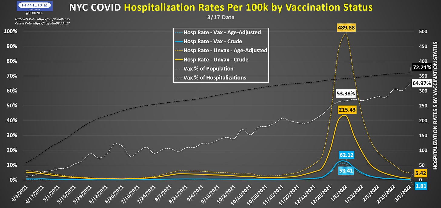
Let’s look at Hospitalizations the same way:
IRRs for Week of 1/8/22:
Age-Adjusted: 489.88 / 53.41 = 9.17X
Crude: 215.43 / 62.12 = 3.47X
IRRs for Week of 3/5/22:
Age-Adjusted: 24.21 / 1.58 = 15.32X
Crude: 5.42 / 1.81 = 2.99X
How can it make sense for Age-Adjusted IRR to be so high and to be increasing significantly when the share of Vaccinated Hospitalizations is rapidly approaching the overall % of Population Vaccination?
Age adjustment CAN be appropriate, especially when severe COVID outcomes are concentrated in older populations, which are typically the most vaccinated. Without age-adjustment, we run into Simpson’s Paradox where lower ages with low mortality and lower vaccination cause a skew to the rates that artificially make vaccinated outcomes look worse.
You may then ask...so why do I disparage the Age-Adjusted rates above while showing Crude rates? The reason is NYC does not share age-stratified results, so we are unable to validate those age adjustments against real data. And, when we compare to England and Denmark, the IRRs are dramatically different than the age-specific IRRs those countries publish.
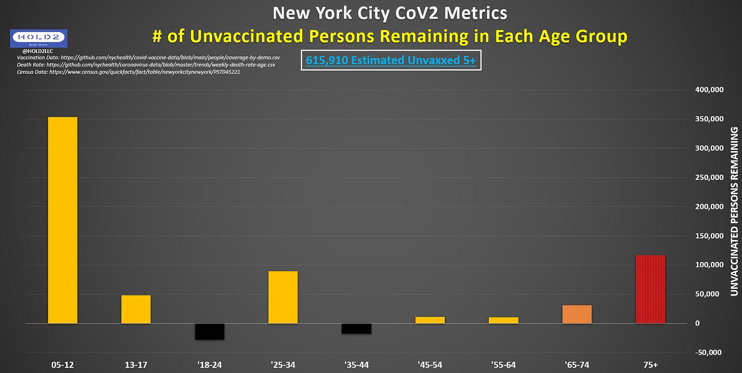
Another reason this is crucial for NYC is because NYC’s data show there are NEGATIVE Unvaccinated persons in two age groups: 18-24 and 35-44 (see below). Additionally, NYC data show there are more Unvaccinated 75+ persons than 13-64 combined and 13-24 + 35-64 combined. Since 75+ account for the vast majority of all COVID Hospitalizations and Deaths, and they have the most Unvaccinated persons remaining, then a standardized age-adjustment may not be appropriate and may even skew in the wrong direction.
This version compares Working Age (18-74) vs. Elderly (75+), which is a relevant comparison when considering NYC still has an employer vaccine mandate, which keeps Kyrie Irving from playing on his home court and will soon cause the same issue for Yankees and Mets players.
There is negligible value from focusing on those remaining 18-74 when you have a much larger number of 75+ unvaccinated who mostly don’t work and are at far higher risk of Hospitalization and Death from a COVID infection.
Let’s go back to the rate comparisons and show Cases. NYC does not perform age adjustment on Cases, presumably because Cases are not affected by age. Accordingly, they only provide Crude rates as shown here:
IRRs:
Week of 1/8/22: 6,287.74 / 2,616.12 = 2.40X
Week of 2/26/22: 93.88 / 42.94 = 2.19X
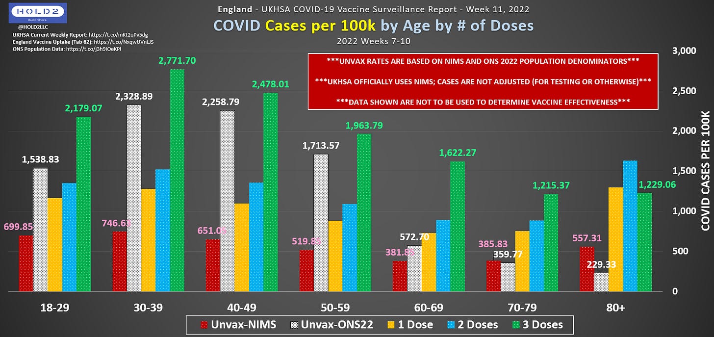
Though 2X is fairly low, these are still not in line with data in England and Denmark that show the opposite relationship.
The Denmark chart showing test-adjusted Cases per 100k by age group, which is better than unadjusted Case rates like we see in NYC and UKHSA data.
Green = 3-Dose (after 14 days)
Blue = 2-Dose (after 14 days)
Yellow = Unvaccinated
Why are the data so different in the US? Here are some of the reasons we’ve learned:
Using older population estimates from 2019 that understate the population, which then reduces the Unvaccinated denominator for COVID outcomes AND lowers the population denominator for Vaccination percentages
US health agencies have disparate systems for COVID data and vaccination data. These do not always communicate effectively or at all, which leaves an unknown number of Vaccinated outcomes in the Unverified category, which gets lumped into Unvaccinated
US health agencies exclude Partial Vax outcomes, and this group includes those who have not completed their primary series, those who did complete a full series but the 2nd shot record is not found, and those who tested positive within 14 days of their last shot
With all of these disadvantages, Unvaccinated still are close to the COVID Case rates for Fully Vaccinated. I expect the trends to continue.
Reference Links:
Bonus charts after the Paywall.


