NYC CoV2 Update - 6/30/22
Vaccinated Share of COVID Outcomes
Today’s @nycHealthy CoV2 data update shows us that the trend continues.
Data: https://github.com/nychealth/coronavirus-data/blob/master/trends/weekly-breakthrough.csv
The share of COVID outcomes are skewing more and more towards those considered “fully vaccinated” by @nycHealthy’s definition. These data do not include those who are partially vaccinated.”
First, the updated chart where showing the share of COVID outcomes among those considered “fully vaccinated” by @nycHealthy, which includes completion of a full series (2 for mRNA; 1 for J&J) at minimum.
The two sets of data labels represent:
Data as of 4/23, which was the date shown in my previous article. All of the Vaxxed COVID Outcome percentages increased, which you can see by comparing with the previous version below
Data as of 6/4/22, which is mostly up-to-date in terms of Vaccine Record Matching. The @nycHealthy data table has data through 6/18, but those data are more incomplete and will revise upward
Overall, the ratios appear to be reaching a steady-state where the percentages are very close to the % who are fully vaccinated:
Vax % of Cases crested at 80% during the week of 4/23 and is remaining steady between 77-80%, which is a few points higher than the % of the population who are Fully Vaccinated
Vax % of Hospitalizations peaked at 73% on 4/30 and remains steady between 68-72%, which is a few points lower than the Vaxxed %
Vax % of Deaths peaked at 75% several times but is more volatile due to the long delay of death reporting and the small number of total deaths. Though this metric has exceeded the Vaxxed % 4 times, the overall trend is slightly below the Vaxxed % of population
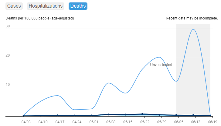
Unfortunately, you wouldn’t know these details if you just viewed the charts @nycHealthy chooses to display. These are way off from reality on the ground.
Any casual observer can tell these are absurd, especially the Hospitalizations. The calculations they use for “age-adjusted per 100,000” are incorrect and misleading, but they keep doing it, and the media and public don’t know any better.
***EDIT - I’m adding 2 charts showing more proof of the @nycHealthy data problems. These data show how absurd the denominators are for Unvaccinated.
This chart is based on the @nycHealthy vaccine data table and shows how many Unvaccinated people exist in each age group 13 and older.
You can see there are now four (4) age groups with NEGATIVE Unvaccinated, which is of course impossible:
18-24, 35-44, 45-54, and 55-64
You also see a huge number of Unvaccinated 75+ who are most at risk and where most Hospitalizations and Deaths occur for/with COVID and otherwise.
This 2nd chart shows the breakdown by race/ethnicity. Besides the fact that over 106% of Asians are supposedly vaccinated in NYC, this chart also shows there are more Unvaccinated Whites (850k) and Blacks (616k) than the total # of Unvaccinated claimed by @nycHealthy (523k).
Somehow, their own data refutes their Unvaccinated rate claims, and they don’t do anything about it.


I’m still not seeing the benefit of this product. There seems to be no effect against the disease with plenty of known risks short term combined with an unknown long term risk profile.