


CDC COVID Outcomes by Vaccination Status
Feb '22 Monthly Update

This post will be free-form so I can get some of this research “down on paper” while putting together the larger investigation.
The overall issue I’m tackling is the seemingly skewed COVID Unvax vs. Vax rates shown by the CDC on this page:
This part of the investigation continues beyond the items already mentioned in my earlier Post/Article:

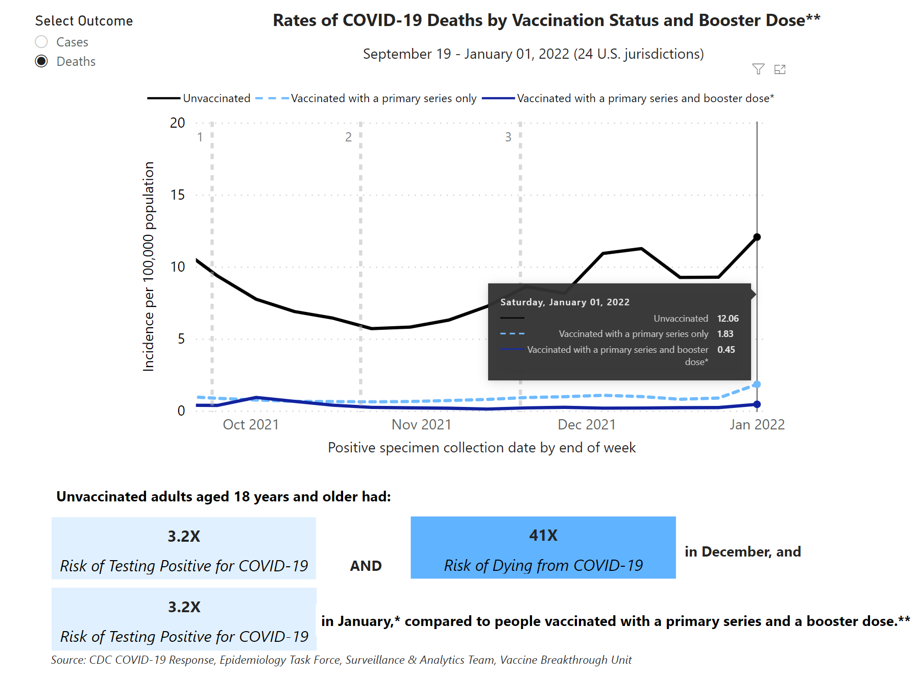
The CDC does not provide the raw, original data, but they do provide the basic data that drives the charts shown on the page mentioned above. This is how the 2 charts look:
One is Unvax vs. Full Vax (Cases shown)

The other is Unvax vs. Full Vax vs. Boosted (Deaths shown)
CDC collects and aggregates data from 29 jurisdictions, and 26 provide data that feed one or both of these charts. We are able to see the aggregate results, though we cannot see their age-adjustment calculations.
What we notice in that dataset is they provide both the Crude and Age-Adjusted rates even though they only show Age-Adjusted rates on the charts. This is important and helpful.
For this post, we’ll be using the data driving the 2nd chart with Booster doses.
First, here’s my version of the same chart above so you can see it looks identical.

The numbers for the last week (Week 52, 2021) are highlighted, and the numbers are identical between my chart and the CDC. This means we’re on the right track.
You’ll notice my chart title specifies “Age-Adjusted Rates Per 100k.” The CDC chart does not specify this, but we know these are the age-adjusted numbers, because they match the age-adjusted columns in the dataset.

For Week 52, the multiples are:
Unvax-to-Full Vax: 6.6X
Unvax-to-Boosted: 27.1X
For December as a whole, the CDC page claims:
Unvax-to-Full Vax: 14X
Unvax-to-Boosted: 41X
We can’t find those numbers in the dataset, but we get similar multiples when we average the last 4 weeks of the year using the last 4 rows of data in the image below:
Unvax-to-Full Vax: 10X
Unvax-to-Boosted: 43X

But now let’s look at the Crude Rates provided in the raw data:
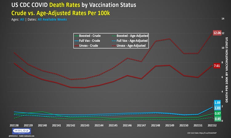
When comparing the Crude Rates (solid lines) with the previous Age-Adjusted Rates (dashed lines), you see a huge difference. Now, the multiples for Week 52 change:
Unvax-to-Full Vax: 4.0X (down 39% from 6.6X)
Unvax-to-Boosted: 7.9X (down 71% from 27.1X)
…and the averages for December are:
Unvax-to-Full Vax: 6.3X (down 37% from 10X)
Unvax-to-Boosted: 12.5X (down 71% from 43X)
This next chart shows only the weekly multiples for both Crude and Age-Adjusted for All Ages so you can see how big the difference is and how much it fluctuates for Boosted.

The dashed lines with checkered numbers show the AGE-ADJUSTED multiples for Unvax compared to Boosted (green) and Full Vax (blue). The solid lines with solid numbers show the CRUDE multiples.
Let’s now view the same data by age group. The CDC only provides 3 age groupings: 18-49, 50-64, and 65+. This is better than nothing but does not give the granularity needed.
Since these are age groupings, the CDC only provides Crude Rates, which makes sense.
18-49

The blank spots on the Boosted (green line) are due to 0 in the denominator. The CDC shows zero Boosted 18-49 deaths those weeks.
50-64

Ignoring the 1-time anomaly in Week 45, we see a range of ~30X-60X.
65+

Like 50-64, we still see a range of ~26X-67X. These are similar to the Age-Adjusted multiples, so the age-specific numbers are not out of alignment with the aggregate view.
All 3 end up between 26-30X for Unvax-to-Boosted and 6-8X for Unvax-to-Full Vax on Week 52, which is right in line with the 6.6X and 27.1X shown earlier and repeated here below:

But now let’s look at the actual rates for each Age Group so we can see the Absolute Rate Reduction (ARR) instead of Relative Rate Reduction (RRR).
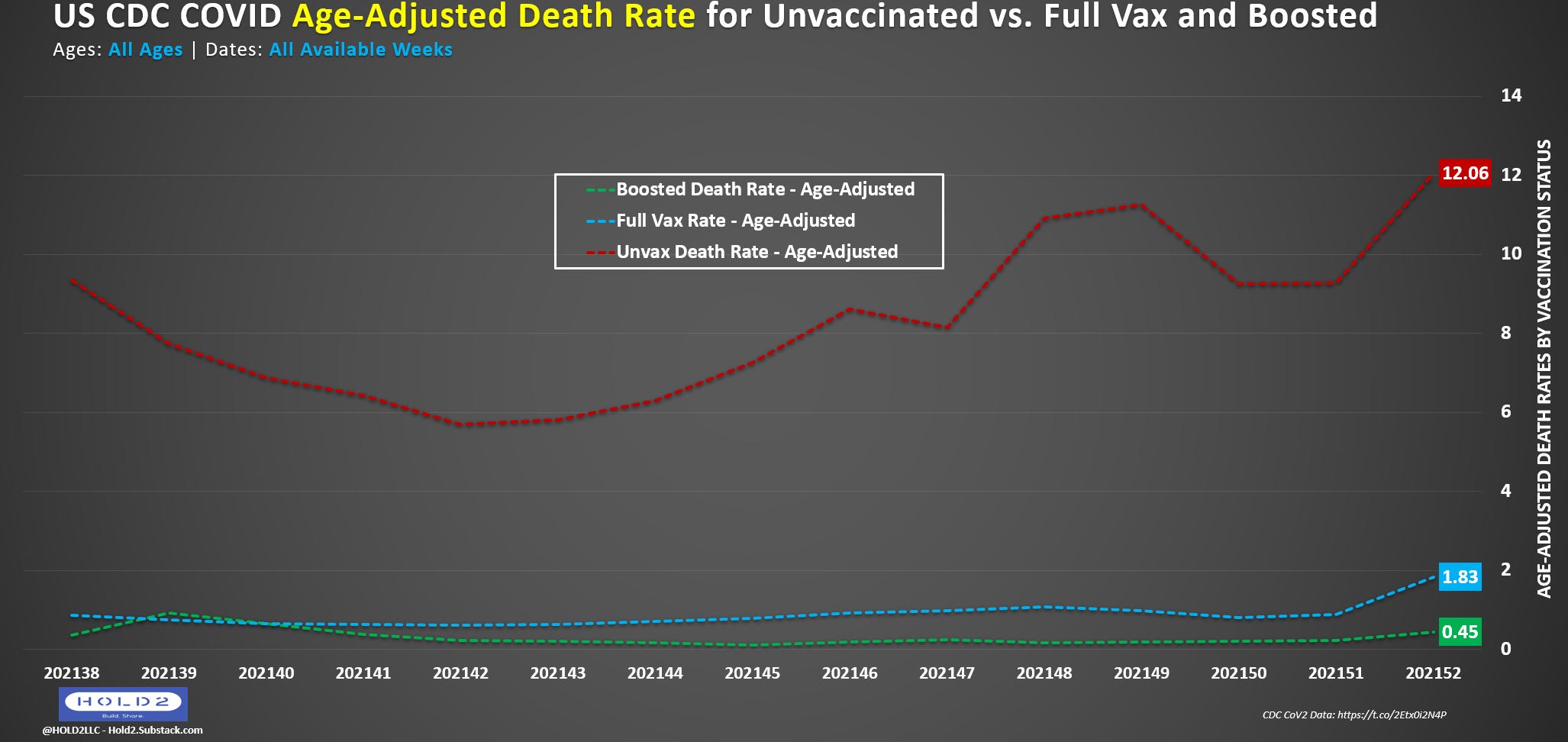
1st, Age-Adjusted Death Rates for All Ages:
Next, Crude Death Rates for 65+ (Age-Adjustment is not done within a specific age group):

Then, 50-64 Crude Death Rates on the same scale (Y-Axis) as 65+:

Lastly, the 18-49 Crude Death Rates on the same scale again. Notice how tiny the ARR is between Unvax, Full Vax, and Boosted:
Unvax-to-Boosted: 1.01/100k ARR
Unvax-to-Full Vax: .92/100k ARR
On average for the 18-49 age group, these data indicate a reduction of 1 death per 100,000 Unvaccinated persons who get Fully Vaccinated/Boosted.
For 65+ and 50-64, the Week 52 numbers indicate a reduction of 54/100k and 8.5/100k, respectively.

As a bonus, let’s compare these rates to the UK for the Weeks 51-02 of 2021-2022:

***Edit: This text was changed due to improperly comparing amplitude of 1-Week US rates with 4-Week UK rates. By nature of being a 4-week report, the UK rates are 4X higher, but this does not change the multiples shown below.
Unvax vs. Boosted
UK 18-29: 0.48/0.04 = 12X; 30-39: 1.44/0.11 = 13X; 40-49: 3.21/0.22 = 15X
US 18-49: 1.05/0.04 = 26X
Unvax vs. Full Vax
UK 18-29: 0.48/0.23 = 2.09X; 30-39: 1.44/0.99 = 1.45X; 40-49: 3.21/2.11 = 1.52X
US 18-49: 1.05/0.13 = 8.08X
Full Vax vs. Boosted
UK 18-29: 0.23/0.04 = 5.75X; 30-39: 0.99/0.11 = 9.00X; 40-49: 2.11/0.22 = 9.60X
US 18-49: 0.13/0.04 = 3.25X
It gets crazier for 65+, especially for Full Vax (2-dose):
Unvax vs. Boosted
UK 70-79: 89.86/5.89 = 15X; 80+: 294.33/33.60 = 9X
US 65+: 56.54/2.12 = 27X
Unvax vs. Full Vax
UK 70-79: 89.86/161.08 = 0.56X (this is negative); 80+: 294.33/547.79 = 0.54X (also negative)
US 65+: 56.54/8.99 = 6.29X
Full Vax vs. Boosted
UK 70-79: 161.08/5.89 = 27X; 80+: 547.79/33.60 = 16X
US 65+: 8.99/2.12 = 4X
Let’s compare that same view with NYC where they only compare Unvaccinated with Fully Vaccinated (no delineation for Boosted). I’m intentionally showing the same date ranges as the CDC data:

These two lines represent the Unvax-to-Full Vax rate multiples just like in the CDC data except Full Vax in this case includes Boosted, which are mixed in.
I also kept the y-axis scale the same for ease of visual comparison.
You can see both lines are lower than the CDC data, and the Full Vax line is nowhere close to the CDC Boosted line, but it is close to the 2-dose CDC line.
The gap between Crude and Age-Adjusted is also very similar.
Look at this next version from NYC, though. This is how those same weeks looked when the data were first reported before completing the Vaccine Record Matching process.

You can see how wild the variations are and how much higher the peaks are for 11/27 and 12/18. The 1/1 rates were tangibly higher, too.
Which set of data does the CDC use? Do they receive the original data or the updated data or both? How many of the other 25 jurisdictions have this problem, and does the CDC continually error check to be sure?
We only know the CDC updates this dataset once per month and that some data does update for prior months when the new month is added. Since we can’t see the underlying data from each jurisdiction, we are not able to see if data like NYC’s is fixed after Vaccine Record Matching.
All we know is the CDC multiples are MUCH higher than what we see in the UK and NYC datasets.
Stopping here for now. Much more to come in subsequent posts. Teaser chart after the paywall.